How to make website sales page in 2026
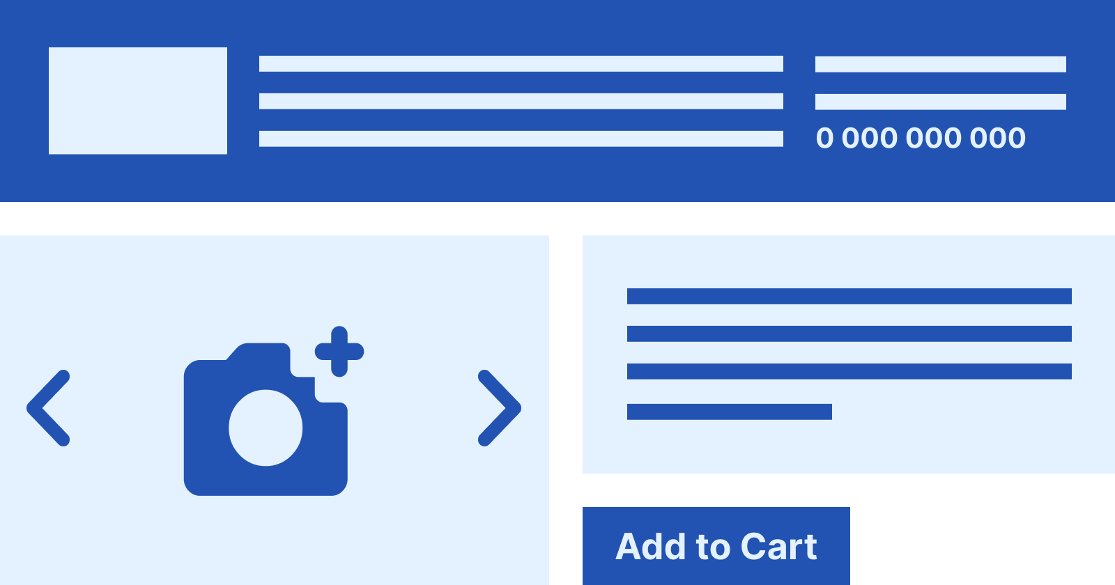
It's not uncommon for large expenditures on advertising not to produce the desired results. In fact, getting people to visit a particular site is not difficult. It's harder to convince him that your service — the best among your competitors, and that's what you should choose.
The sales page — is the place that motivates customers to place an order, buy a product, or leave their contacts. Such a page is also called a landing page (Landing page) or “landing”.
What makes a landing page stand out
Sometimes business owners notice that people quickly leave the site without any interest. This is usually due to two reasons.
- Weak sales page of the site, losing out to the competition.
- Untargeted traffic caused by improperly configured ads.
Site conversion, and therefore profit=development of the business, directly depends on the quality of the selling pages (landing pages). That's why they should be given maximum attention. In fact, landing page — this is actually the face of the site.
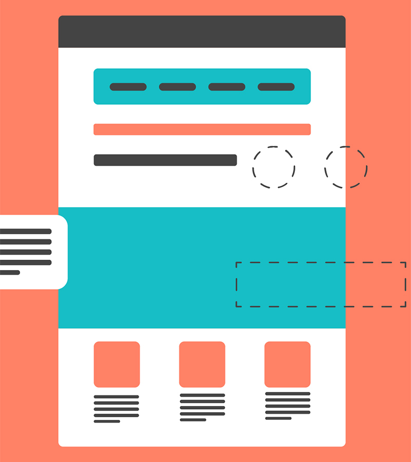
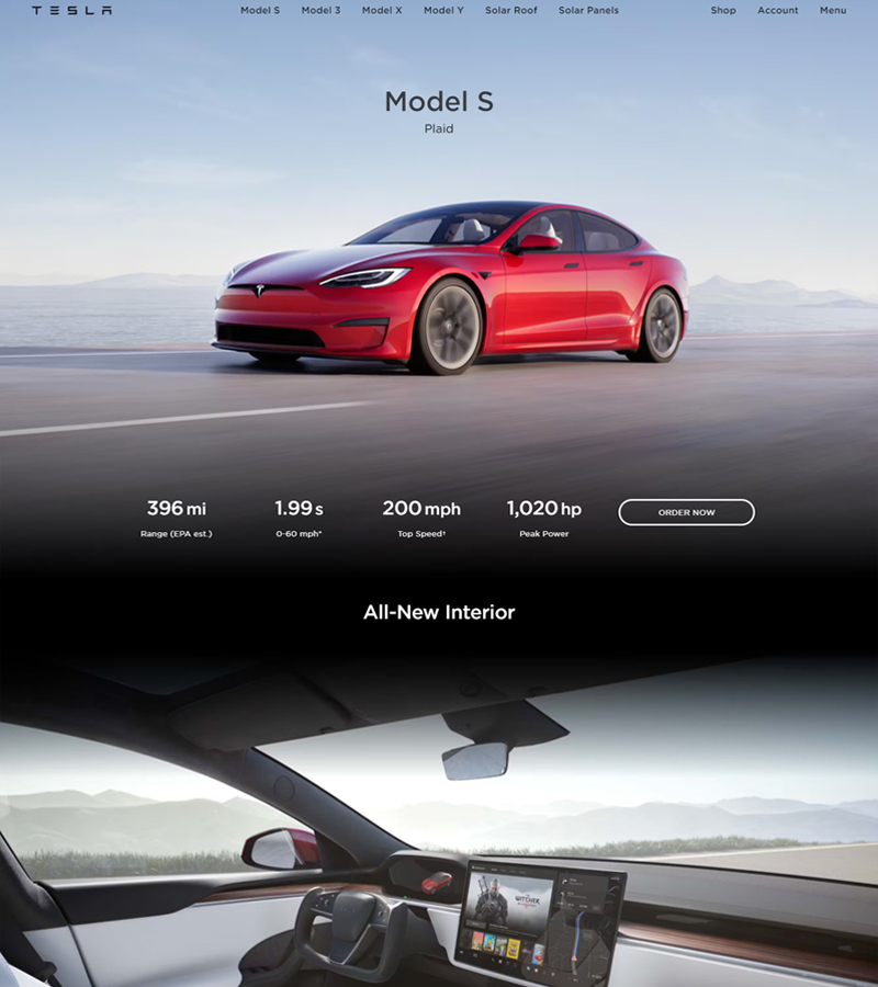
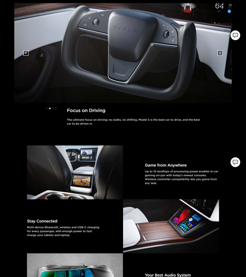
Good examples of landing pages — leaf through the slider
What a sales page consists of
For a sales page to be as effective as possible, you need to know and understand your target audience well: what problems people care about, what their needs are, what they need most already.
Everything that is offered on a sales page should be laid out simply and clearly, without redundant information. In particular, overloaded content usually doesn't appeal to people and can drive them away. Your offer should stand out in the marketplace and truly address the customer's concerns.
Ease
The sales page shouldn't have huge text "sheets". People buy with their eyes first, especially in 2026. So visualize the content as much as possible.
Use examples from everyday life where your product is useful and saves the day.
Benefits
Show the benefit and benefit directly to the customer of buying your product. Please remember, your product sales problem and the problems of specific users — are different things!
Explain on your fingers that only buying your product or service will be the only correct solution to resolve the problem. You need to point out the negative consequences that can occur if the customer's problem is not solved — play on customers' emotions. (Within reasonable limits, of course)
Uniqueness
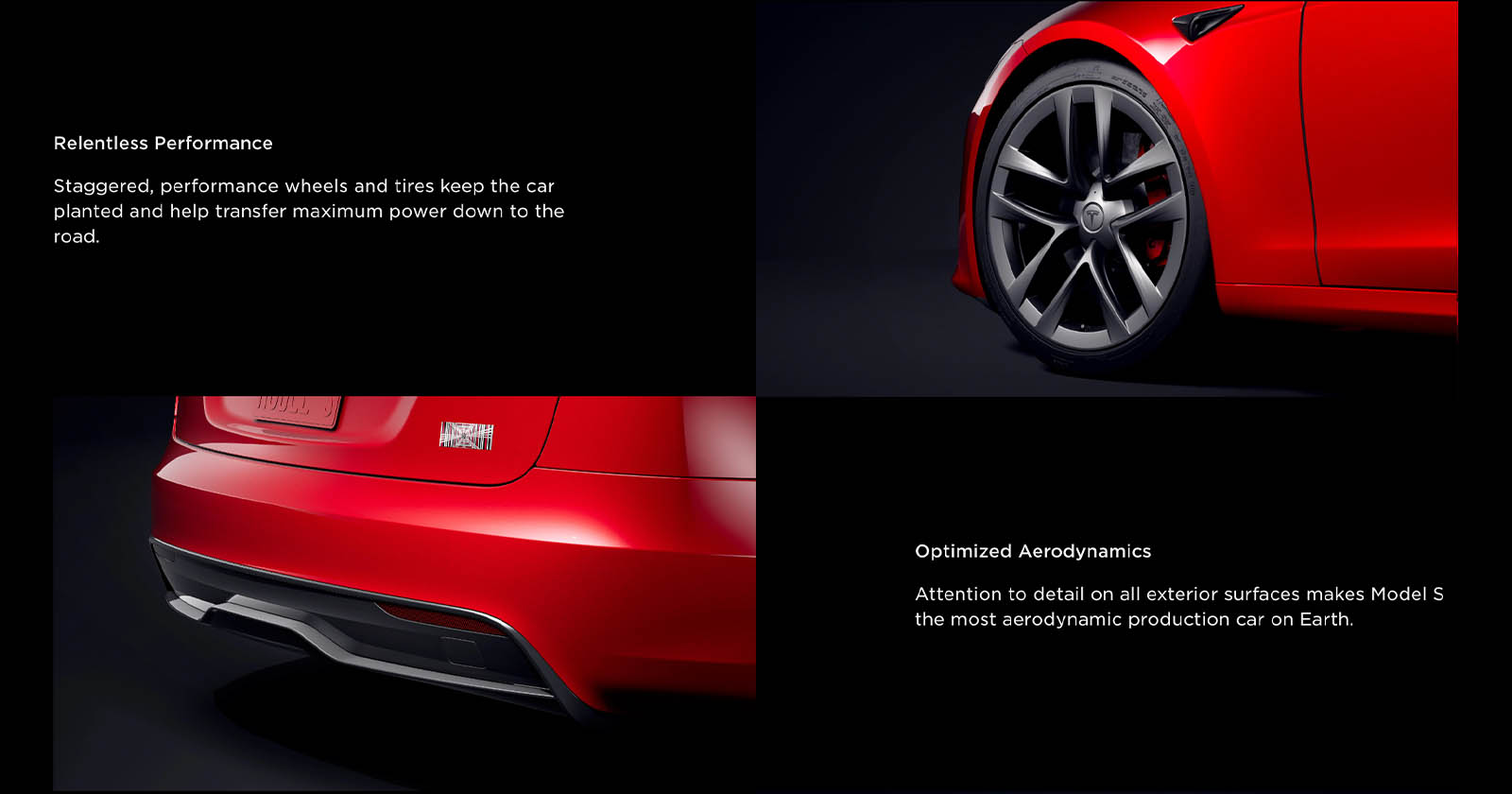
The website's sales page should create a unique selling proposition (USP). It includes the perfect mix of price, sales options, all sorts of bonuses, etc., which is great for attracting buyers.
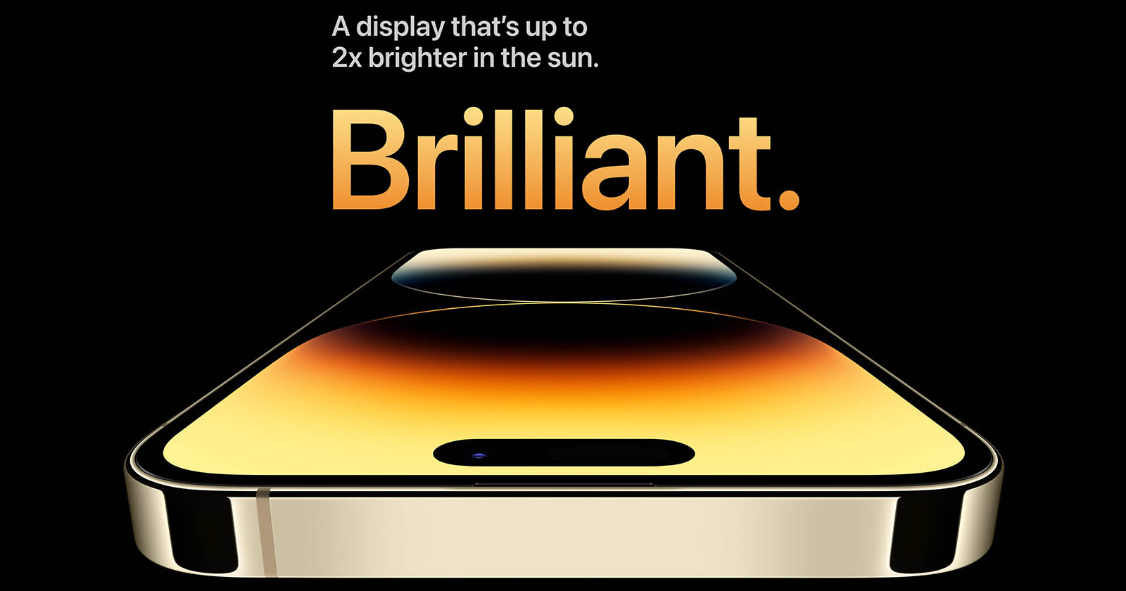
Don't create too much choice on one page that makes your eyes diverge. Limit yourself to the brightest and most memorable offerings.
Reviews
Show positive feedback about the product. People will have more confidence if you include links to their authors' pages on social networks.
Your product or service should have a warranty, refunds, tech support, etc. The customer pays their money and wants to be sure there are no risks and the quality of the product.
Payment
Provide different payment options to cover the maximum number of payment systems. For example, the “buy” or “put in cart” button should appear several times on the page, attracting enough attention as you view the material.
Chat with operator
Live Chat with a live operator dramatically increases conversions and interest in your product! Set it up to make it easy for customers to ask any questions and get an instant response. The help of specialists is always in demand on the market of Internet services.
Sales page structure in 2026
To make sure that the landing page is guaranteed to cope with the task — successfully sell — it is worth taking care of such visual elements:
- Basic headline. This headline should be fairly brief, but informs well about the benefit the customer will receive by ordering your product or service. Specifically, a good headline shows how your offer is fundamentally different from your competitors' product.
- Information block. It should inform visitors in more detail about the properties, quality of your product or service, its advantages over competitors.
- Picture. This is something that should present all the best aspects of your product in a favorable light. You can use a photo of the product, charts of its use, comparison tables with competitors or a variety of charts.
- Reasons to buy. For a product or service to be in demand, you need to prove that it is really in demand. It can be a photo or video showing how the product is used, or even a full review. Above all, it's important to include the opinion of real customers who have already used your services.
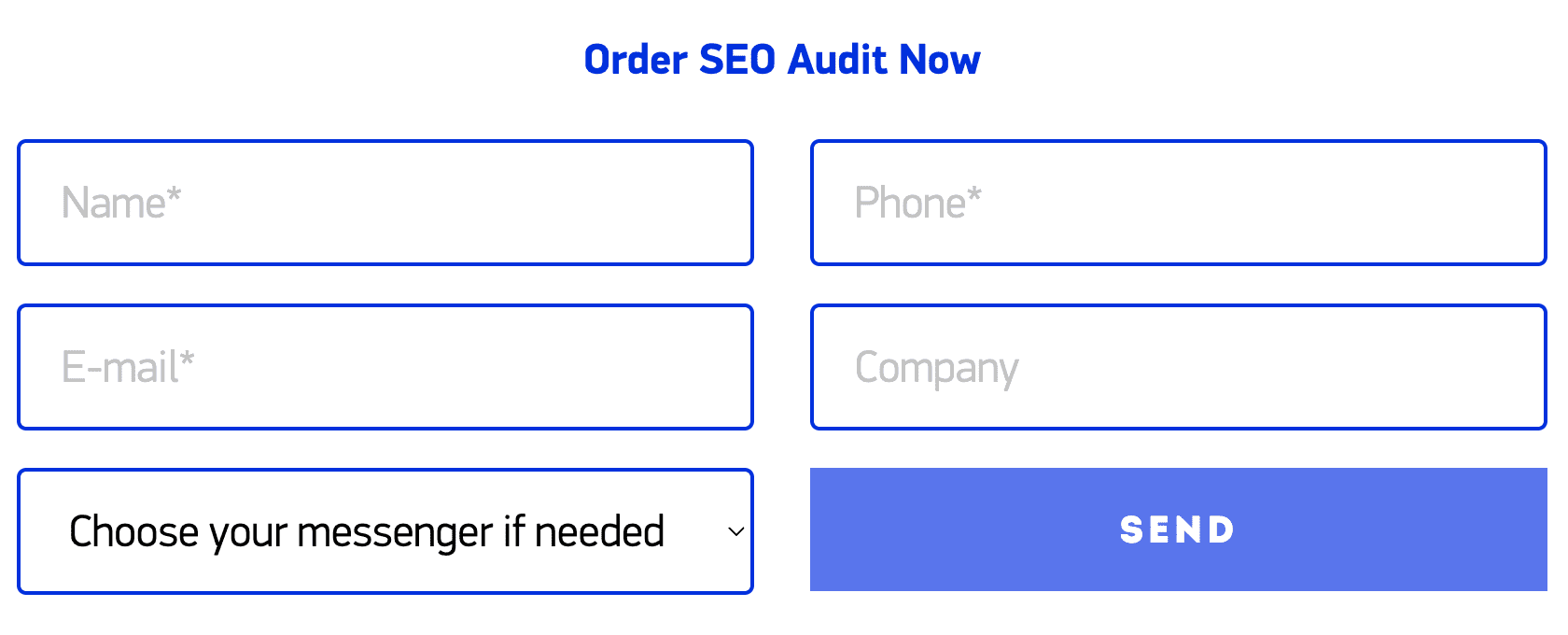
- Form to send personal information: name, email address, phone number, etc. To motivate the client to fill out the form, you can offer him a nice bonus.
Customer interaction
The final moment of the sales page is the call to action. This requires an active button that encourages the client to make a purchase or order a service. Moreover, it should not be formulaic, but with a description pointing out the real benefits and advantages.
The visitor shouldn't lose interest in your product, even if he doesn't order right away. That's why you should count on long-term results. Register your company's groups in social networks and tell people about them on the site. In addition, you can make a modal window that will pop up after a certain time. On it, offer to leave your mail or add the site to bookmarks.
The sales page on the site will be effective if the information is laid out clearly and to the point. It is also important that we are talking about only one product or service for one landing page. Otherwise, the online resource becomes difficult to grasp, and therefore decreases its conversion and attendance, site promotion is slowed greatly.
Conclusion
The website sales page — is one of the most important tools in business.
In order for a landing page to maximize benefit and increase sales, it must be simple and user-friendly, as well as attractive to search engines. You can check this out quickly and for free by doing SEO site analysis with our tool.


